Smarter for government. Easier for everyone: Behind our updated brand.
You might have noticed we upgraded our logo and brand identity this week. It’s been an exciting and rewarding project for our team, and I am eager to share some of the background that led to the changes. We think the new branding elements better reflect PayIt’s vision, the goals of the agencies who use our platform, and the millions of residents we serve.
When John and Mike founded PayIt back in 2013, the idea was pretty simple: make interacting with government agencies as easy as it is with commercial entities. As they conducted research, they discovered that government agencies have been badly underserved by traditional players in the GovTech industry. Government agencies pay too much for antiquated software that’s hard to operate, almost never updated, and treats residents as an afterthought. It was well past time for a change.
And thus – PayIt was born, with a vision to take the friction out of government-resident transactions with modern, easy-to-use software. Software designed for real people. Fast forward to 2023, where we serve more than 80 million residents in North America and counting.
We know our platform is special — it makes life easier for the people on both sides of the agency desk. But our brand identity wasn’t as distinctive or modern as our software — and that needed to change. We wanted our brand to do a better job of showing people who we are.
OK – for you brand nerds out there, here are some of the details of our brand upgrade. The new logo preserves a simplified version of the rotunda icon to show clearly that we’re made for government. (Fun fact: behind the scenes, we refer to the rotunda as “the cupcake,” because it kind of looks like one, and who doesn’t love a cupcake?). Nestling the rotunda into the conversation bubble shape speaks to the human-centric nature of our software and the ease it brings to an agency / resident interaction – it’s like a quick chat between real people.
We chose a modern font for the logo that’s a bit easier on the eyes than the earlier version. And it just made sense to have it capitalized the same way our company name is: PayIt.
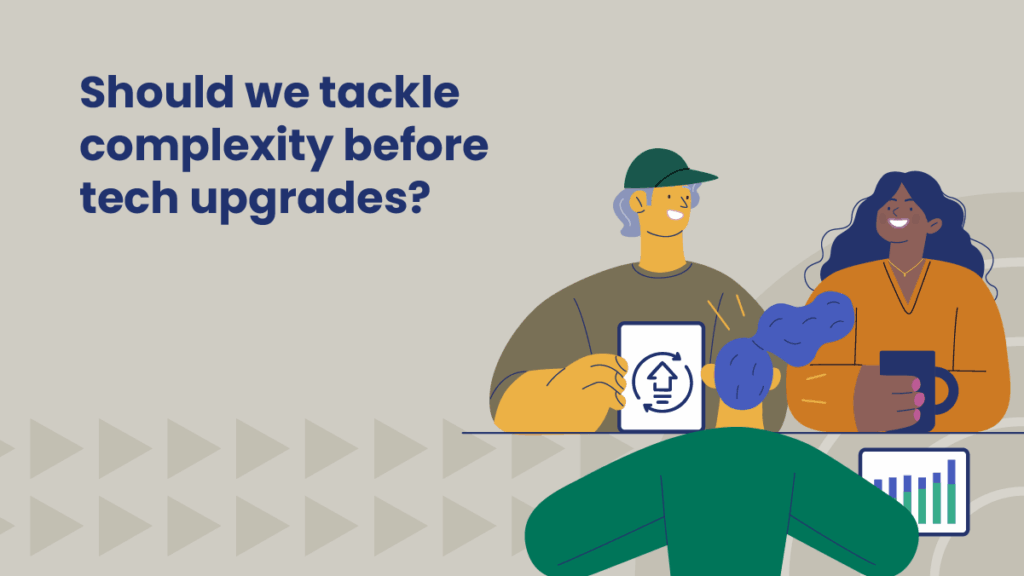
When you encounter us online or in real life at events, expect to see a few other changes: a refreshed color palette, updated imagery, and clearer copy.
And last but not least, we’ve coined a new tagline to capture the essence of PayIt simply and elegantly: Smarter for government. Easier for everyone.
Looking for more content?
Get articles and insights from our monthly newsletter.